Filippo Fontana
Website rebranding and restyle: design, UX, and performance for an evolving coach.
New digital energy: restyling between branding and performance.
Visual identity reinvented
The previous logo, consisting of an unbalanced pictogram and lettering, spoke to a narrow, male, bodybuilding-oriented audience.
To communicate movement and energy, as well as openness and inclusiveness, we created a logotype whose shapes alternate between sharp edges and curvilinear forms, a balance that better represents the variety of both male and female services offered by the client.
Finally, the neutral-tone palette ensures legibility and continuity, incorporating a fluorescent accent as an energetic, contemporary, living note.
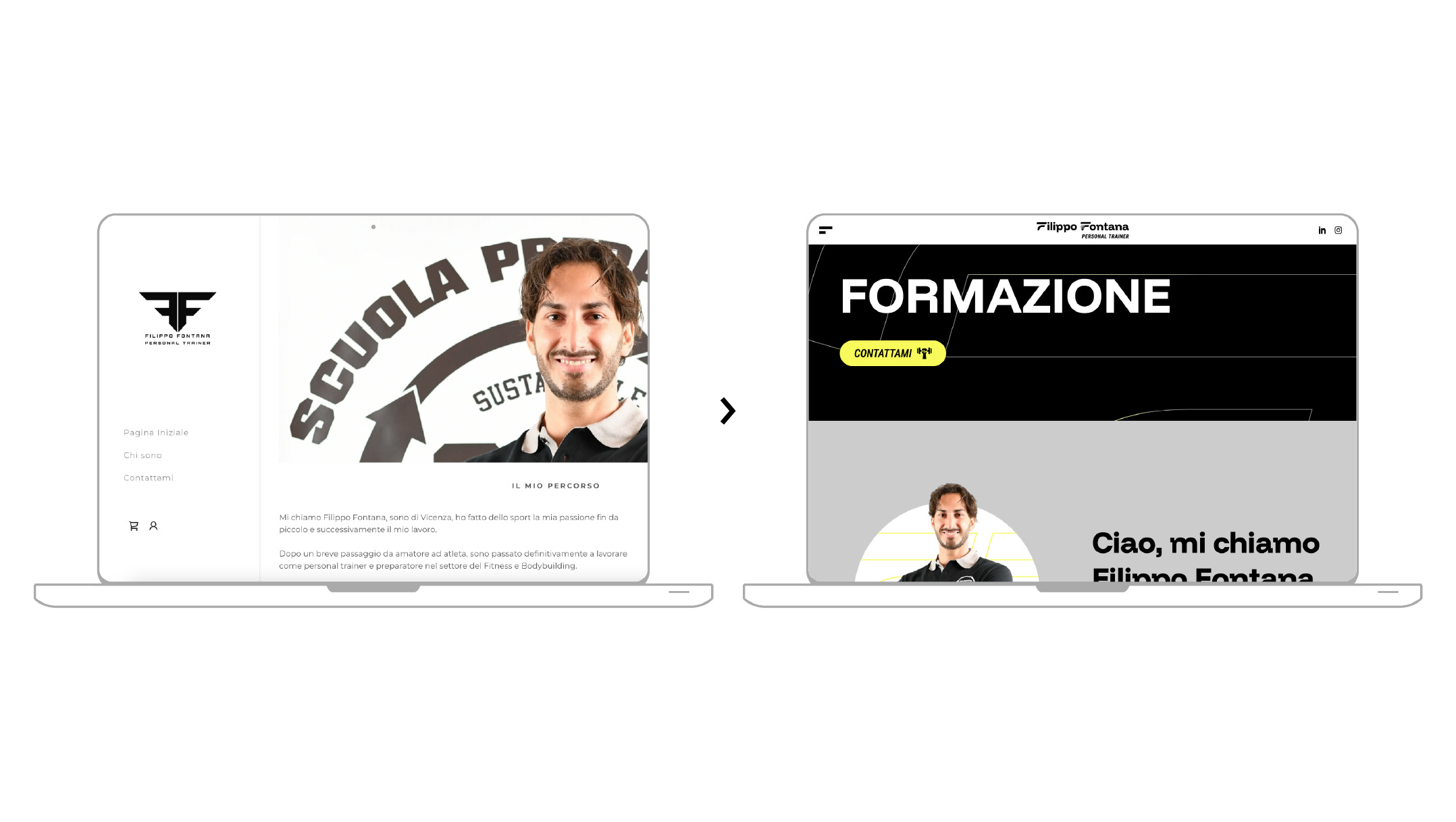
Putting the experience in order
The old site reported structural and hierarchical disorganization, compressed text, and unintuitive paths of action.
While keeping the tree structure unchanged, the narrative of the site has been completely redesigned: each section now has a clear purpose, with a smooth scroll, internal anchors to nimbly navigate between related sections, and simplified content reading.
Mobile-first not as a slogan, but as a method: considering that more than 70% of users come from smartphones, touch interaction has become the basis of all design.
A UI that speaks of modern fitness
We built a visual system capable of communicating the client’s identity and, more importantly, of competing in the digital marketplace.
A clean, readable design with strong contrasts, sporty but not aggressive fonts, and a content layout that allows the user to breathe, observe, and act.
Micro-interactive elements (light transitions, CTA button highlighting, logo and detail animations) were integrated with the rest.
Each graphic component was designed with specific goals in mind:
- Make the message clear and immediate
- Promote user action, both from mobile and desktop
- Maintain visual consistency across touchpoints.
The result is an interface that supports customers in their daily communication and adapts naturally to the different types of users who follow them.
Why this project matters to Tidycode
What was accomplished for Filippo Fontana was not a simple “restyling.” It was a process of identity and design redefinition. It is an example of how we can support a professional in telling his or her story better online, through tools that are tailored, high-performing, beautiful to look at, and pleasant to use.
And it is also the kind of project we love to do: where design, strategy, and visual precision come together to create real value.
Do you want to create a site like this?
Tidycode is the ideal agency with which to build your e-commerce site and get your online business off the ground.

Vuoi dare una svolta al tuo business?
Parliamone subito.